HiNVASIVE
Dedicated mobile app and companion dashboard
Help protect our forests from invasive species
Hawaii’s ecology has evolved over time to live in perfect harmony. Invasive species can quickly throw off the balance and decimate native species.
HiNVASIVE
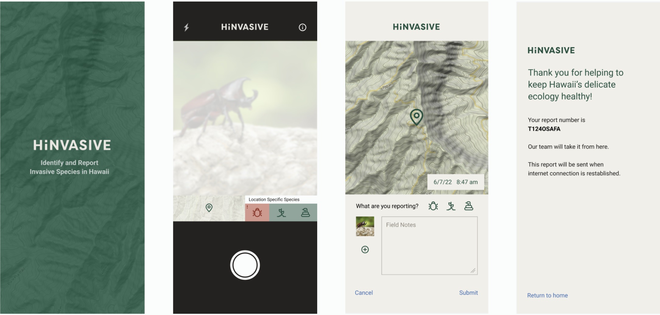
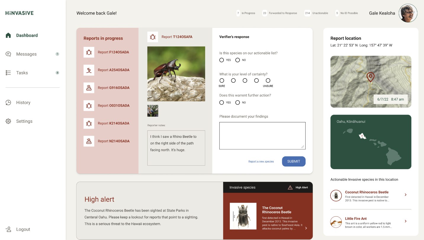
The HiNVASIVE dedicated app helps Hawaii hikers identify and report invasive species. The list of species the user sees changes based on location and ecology threat. The companion website is a portal/dashboard to help a volunteer team validate the reports and direct responses.
Below are the highlights of my design process. I simplified some steps and details to keep this case study manageable.
Project duration:
May 2022 to June 2022.
Project overview
The challenge:
Apps need an internet connection to load maps to work with GPS. When hiking, there is no connection, so the user can’t visualize their location.
The goal:
Design a solution allowing hikers to access all the information needed to verify and report invasive species in a dedicated app without taking up much storage space.
My role:
Product Designer
Responsibilities:
User research, wireframing, low and hi-fi prototyping, conducting usability studies, and iterating on designs.
Approach:
Empathize, define, ideate, prototype, and test.
Results:
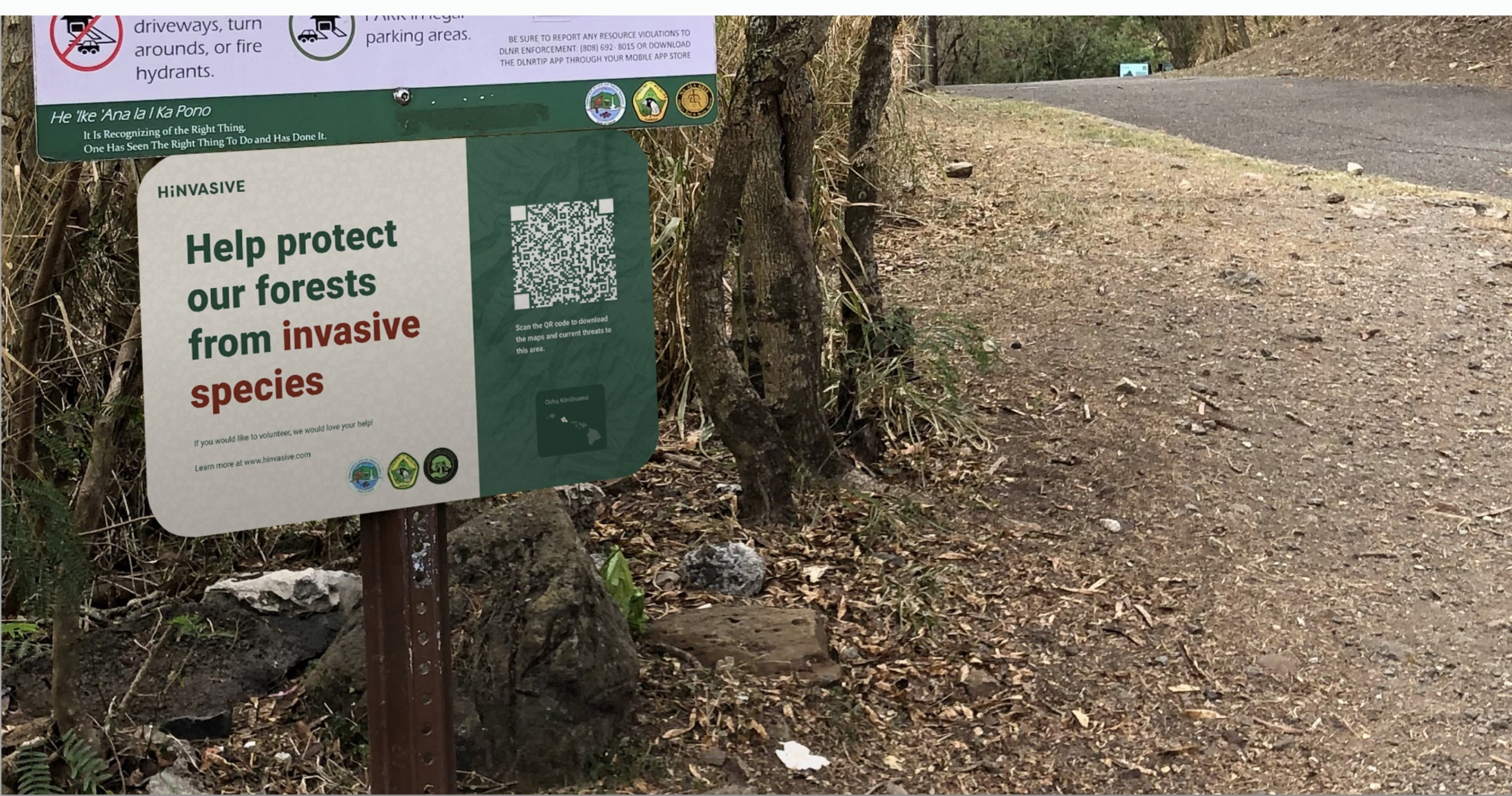
The result is a product that partners with parks services to have signage at the beginning of a hike to nudge the user to download the needed maps and invasive species information for the current area.
Understanding the user
User research
Personas
Problem statements
User journey maps
User research: summary
I conducted interviews and created empathy maps to understand the user I was designing for and their needs. A primary user group identified through research is hikers who want to help identify and report invasive species.
This user group wants to give back to the land. They are hopeful for the future and optimistic that they can make a difference. They want technology to help assist them in doing social good.
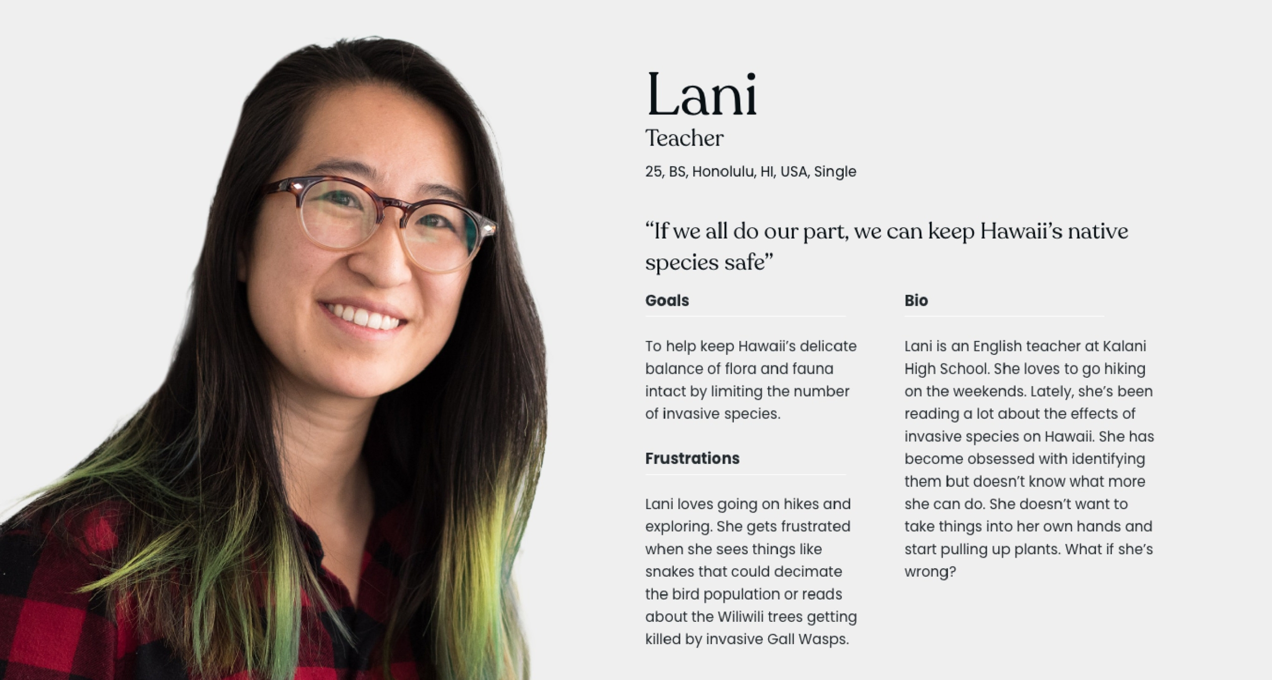
Persona: Lani
Problem statement:
Lani is an avid hiker who needs identify and report invasive species because it’s important to her to help protect Hawaii’s delicate ecology.
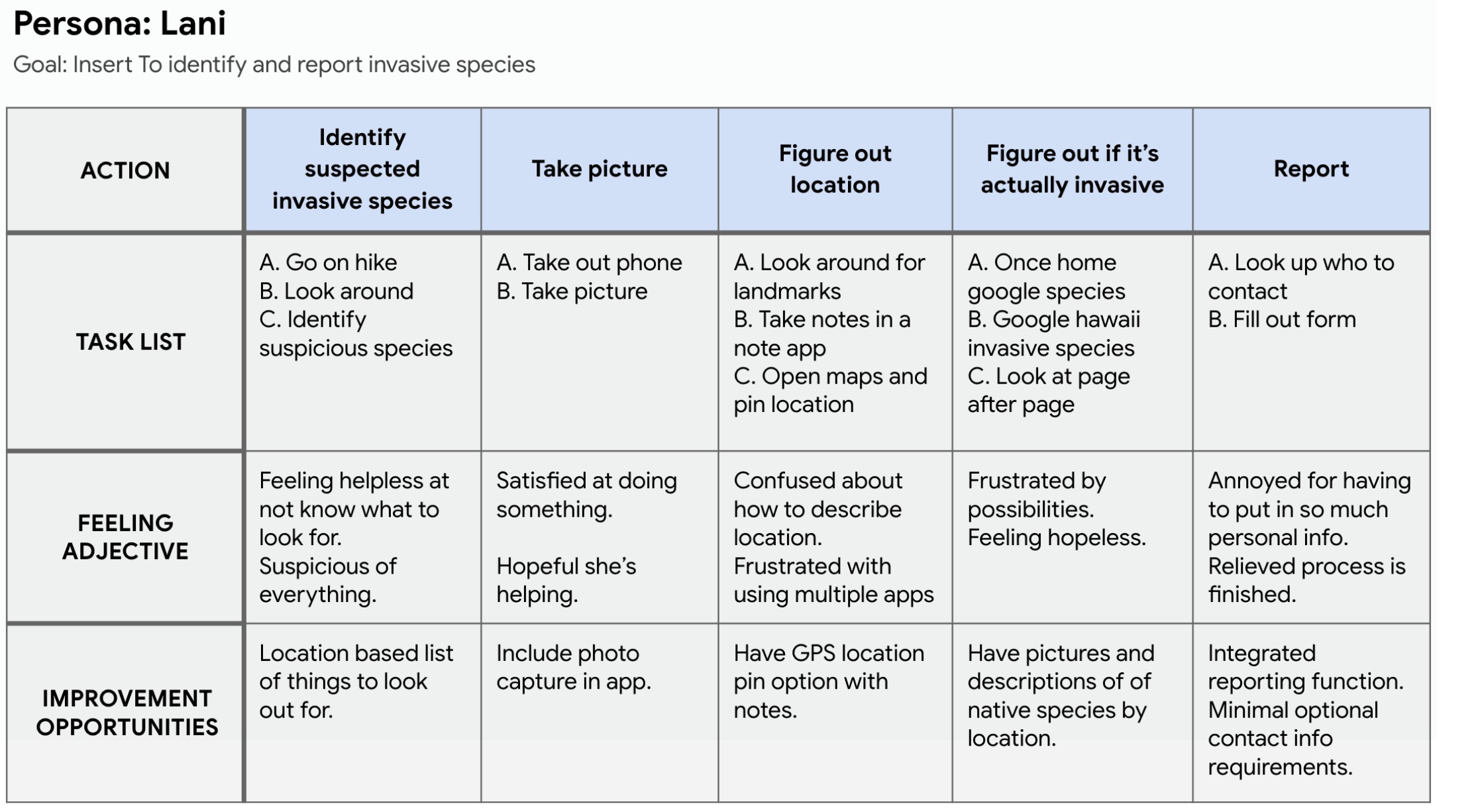
User journey map
Mapping Lani’s user journey revealed many areas to add a helpful functions to an app, including custom results based upon GPS location, in app photo capture and automatic location mapping, and easy reporting function.
User research: pain points

Reporting potential invasive species isn’t convenient.

Pinpointing the place where the species has been identified is difficult.
Second user group
A second user group identified is citizens who want to volunteer their free time to causes they believe in.
Persona: Gale
Gale is a retired grandmother of 8. She loves retirement but still wants to be a productive member of society. Gale enjoys helping others and does a lot of volunteer work, and she also enjoys going to the park and painting landscapes. Gale feels blessed to call the islands home and wants them to stay beautiful. She is looking for the next good cause to volunteer for.
Problem statement:
Gale is a retired grandmother of 8 who wants to help validate invasive species to the islands because she wants her grandchildren’s grandchildren to have a chance to see Hawaii as she does.
User journey map
Mapping Gale’s user journey revealed opportunities to simplify the validation process by providing lists of native comparables by location and showing invasive options that can only survive the areas Hardiness Zone.
Pain points

Researching possible species brings up many options that can’t even survive in Hawaii’s climate.

Validating species and organizing can be bureaucratic.
Competitive audit
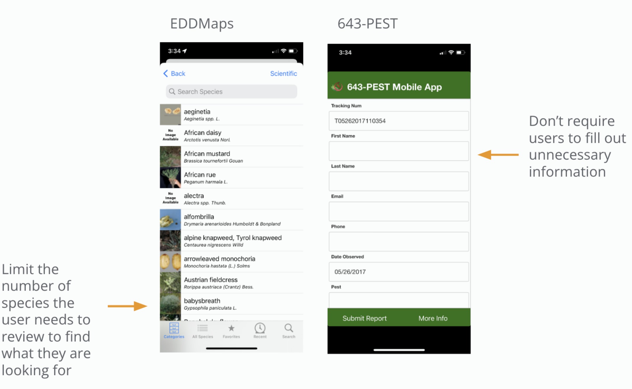
A competitive audit revealed rivals 632-Pest and EDDMapS. They both have great functionality, but the user experience is lacking. I discovered an opportunity to create a better experience by simplifying the reporting process by displaying only location-based invasive species that are a high-level threat. And also limit personal information to be submitted, which will significantly improve the speed of identifying and reporting.
Starting the design
Crazy 8s
Wireframes
Low-fidelity prototype
Usability studies
Paper wireframes
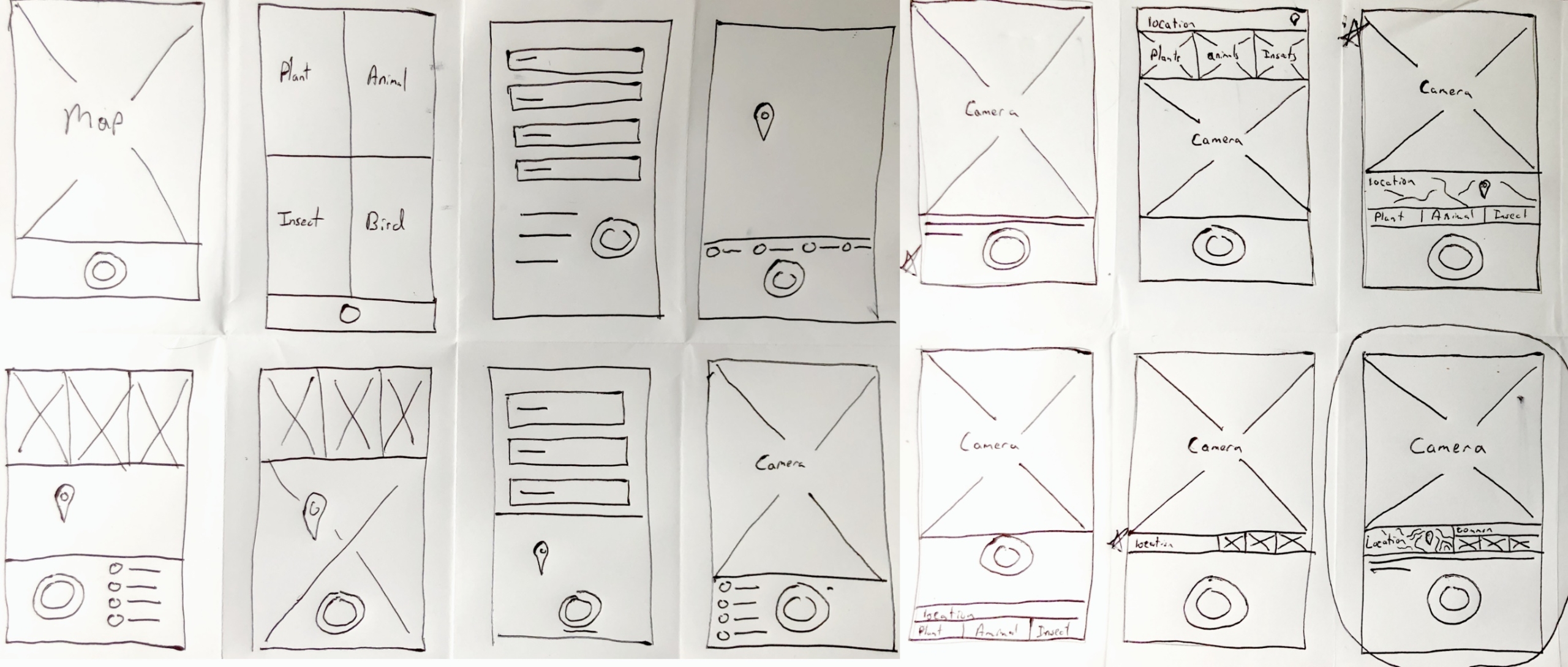
I ran a crazy 8s exercise to ideate the customization flow, quickly sketching 8 possible design solutions for users based on answers from a “how might we” exercise. The resulting directions put me on a path to the best solution. I quickly realized that jumping straight into the camera was the best solution to capture quick moving critters.
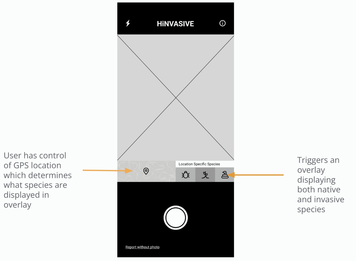
Sketching out several iterations for the main screen helped gain a better idea of the structure of the app. I selected the best parts and consolidated them into a single design seen on the bottom right.. This included a camera, location selection and location based invasive species list. Next I moved to digital wireframes to bring more clarity to the design.
Digital wireframes
The main user flow is designed to be quick and easy to complete so that hikers aren’t discouraged to report invasive species while enjoying a hike.
The report submission is kept simple. Validators will access the companion website and use their experience to quickly determine if a species is a threat.
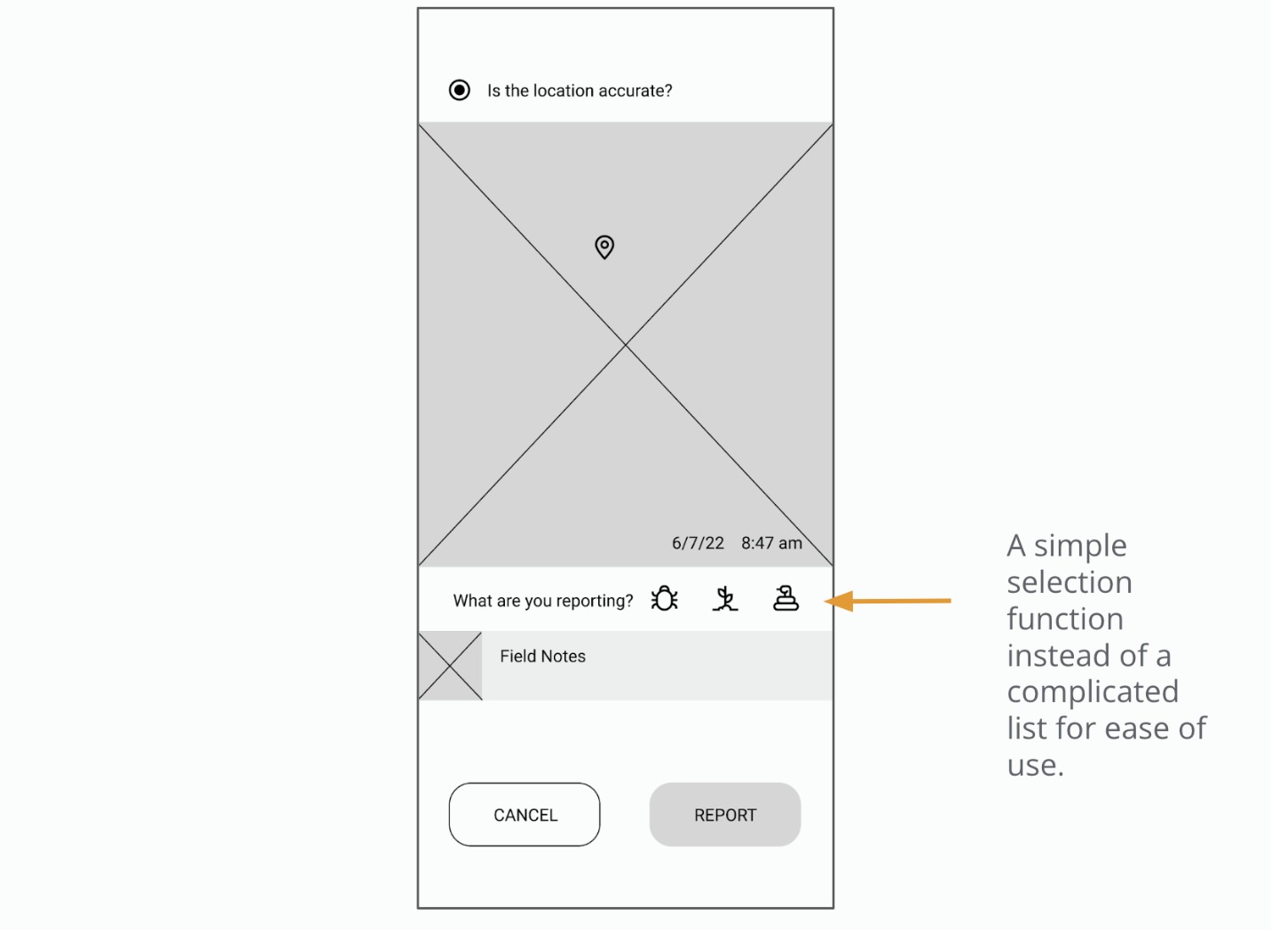
Low-fidelity prototype
The low-fidelity prototype connected the primary user flow of reporting an invasive species to ready the design for a usability study with users.
Usability study: findings
Findings from the first study helped guide the designs from wireframes to mockups. The second study used a high-fidelity prototype and revealed what aspects of the mockups needed refining.
Affinity map
I mapped out the results of the usability studies by organizing them into themes. Through mapping, I gleaned insights to turn into actionable revisions.
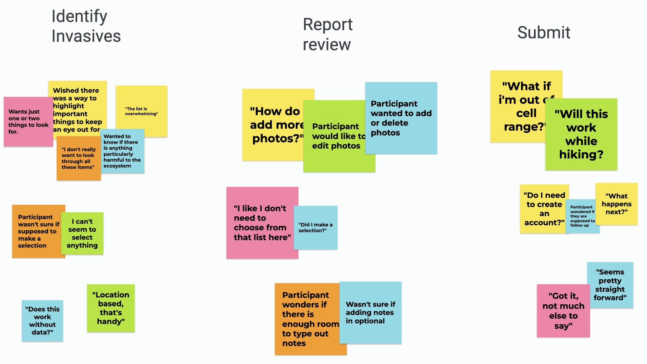
Round 1 findings
Round 2 findings
Refining the design
Mockups
High-fidelity prototype
Accessibility
Mockups
I was getting feedback from users that the species list was hard to navigate. To address this concern, I highlighted the most important species to identify and list a limited number of other high-priority species below.
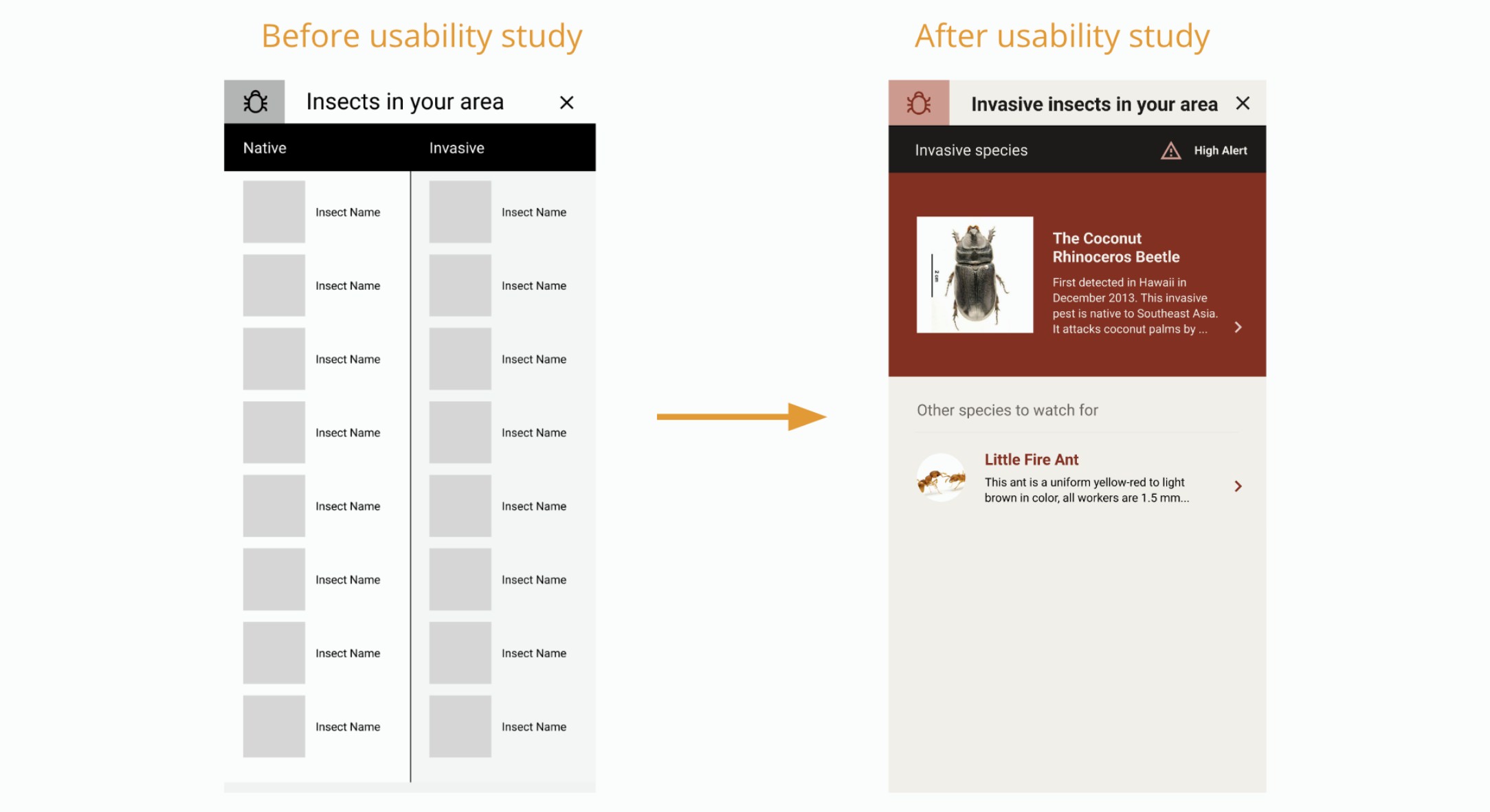
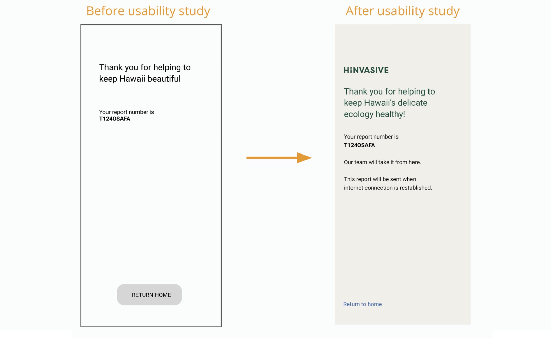
Based on insights discovered during usability studies, I added a function to send the report once the internet connection is reestablished when hiking in remote areas.
Design choices
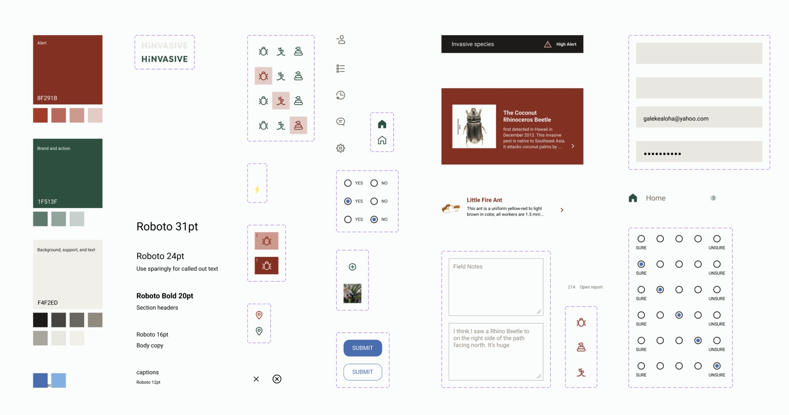
The color palette mimics the state park color. The background color is a light toupe and the brand color is forest green. The color red is used consistently to mark invasive species. Blue is used sparingly as a call to action.
The font is a clean san serif that lets the graphics and communications be front and center.
There is a strong use of a grid and everything is kept professional and clean.
Hi-fi mockups

High-fidelity prototype
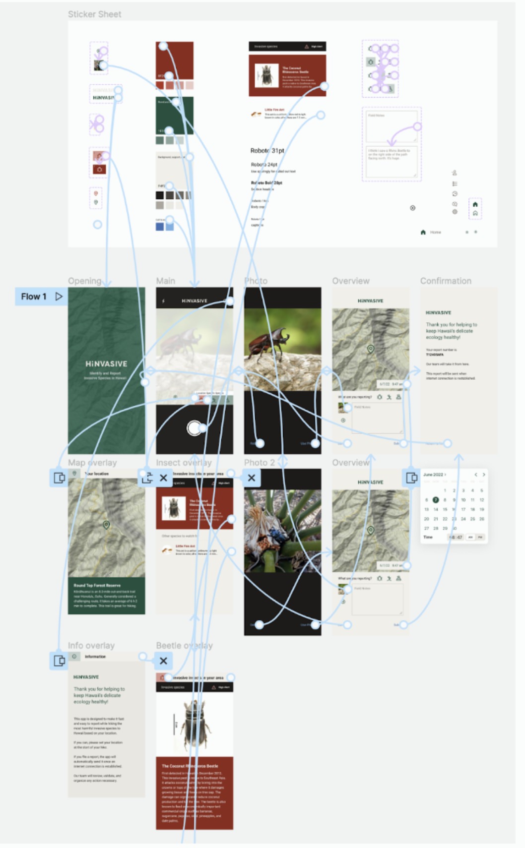
The prototype utilizes overlays to reduce the number of pages and connections needed.
Trailhead signage
Signage at the beginning of a hike to nudge the user to download the needed maps and invasive species information for the current area.

Desktop dashboard
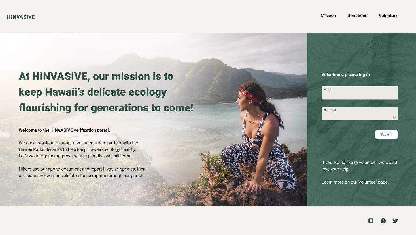
I designed the website to be a desktop dashboard to accompany the mobile app, but there is still much helpful information for visitors. I created the layouts to be responsive and adjust to multiple screen sizes.
High-fidelity prototype
The prototype utilizes overlays to reduce the number of pages and connections needed.
Accessibility considerations
Going forward
Takeaways
Next steps
Takeaways
Impact:
Quote for usability study:
“This is really easy to use and intuitive, I can’t wait to see what the next phase brings”
What I learned:
This project taught me how to simplify functions down to their core. It takes more time and effort, but the results make for a usable product.
Next steps
This is the store’s MVP. Based upon user research, some items to highlight for future versions of the store are:
Thank you for your time reviewing my work!
If you’d like to get in touch, please reach out at: william@wmdesignworks.com
