Bergeman Group
Evolving the Bergeman Group brand
Building peace of mind
The Bergeman Group truly builds peace of mind. At the heart of their business, they manage a complicated process for their clients by facilitating with contractors and overseeing large construction projects.
Project overview
The challenge:
When the Bergeman Group came to me, they didn’t feel their branding properly communicated the value they brought to their clients.
The goal:
Keep the current logo, but evolve the visual brand identity as well as the tone and voice of the company to communicate more clearly the company’s beliefs.
My role:
Brand Design / Visual Design.
Responsibilities:
Visual Design, mock-ups, hi-fi prototyping, and iterations.
Approach:
Research, discovery, research, define, ideate, create.
Results:
A brand evolution included a new tagline, updated color palette, new brand visuals, website design, brand collateral, and print and digital marketing & communication assets.
Project duration:
Ongoing.
Starting with “why”
Tagline
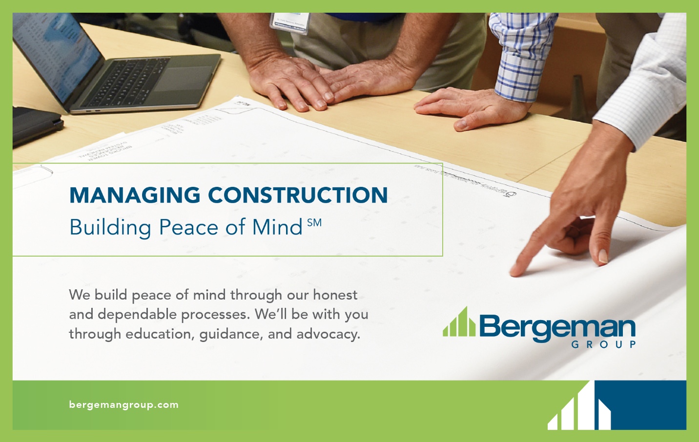
The company needed a core message to bring them focus; a simple statement that defines their “why,” their purpose. Through research, I discovered that, first and foremost, their clients wanted to know the Bergeman Group was protecting their best interests. A building is a significant investment, and a lot is at stake. To wrap this up in a simple phrase, I crafted “Building Peace of Mind.”
Defining the brand
Mood Board
Footer
Color Refinement
Typography
Mood Board
Once we agreed upon the tagline, the next step was to define the look and feel of the brand. We were going to keep the original blue and green, so I focused on selecting photography with those colors. Closely cropped photography promotes a sense of curiosity. Human-focused main images where the subject doesn’t look into the camera provide a sense of authenticity. The illustration style is hand-sketched to add humanity to the brand and give it an architectural feel.

Footer
To help visually distinguish Bergeman Group from the crowd, I designed a footer to be a consistent brand element for marketing and communications. The footer will keep a cohesive brand look through all mediums, and this will evolve and adapt to the medium.

Color Refinement
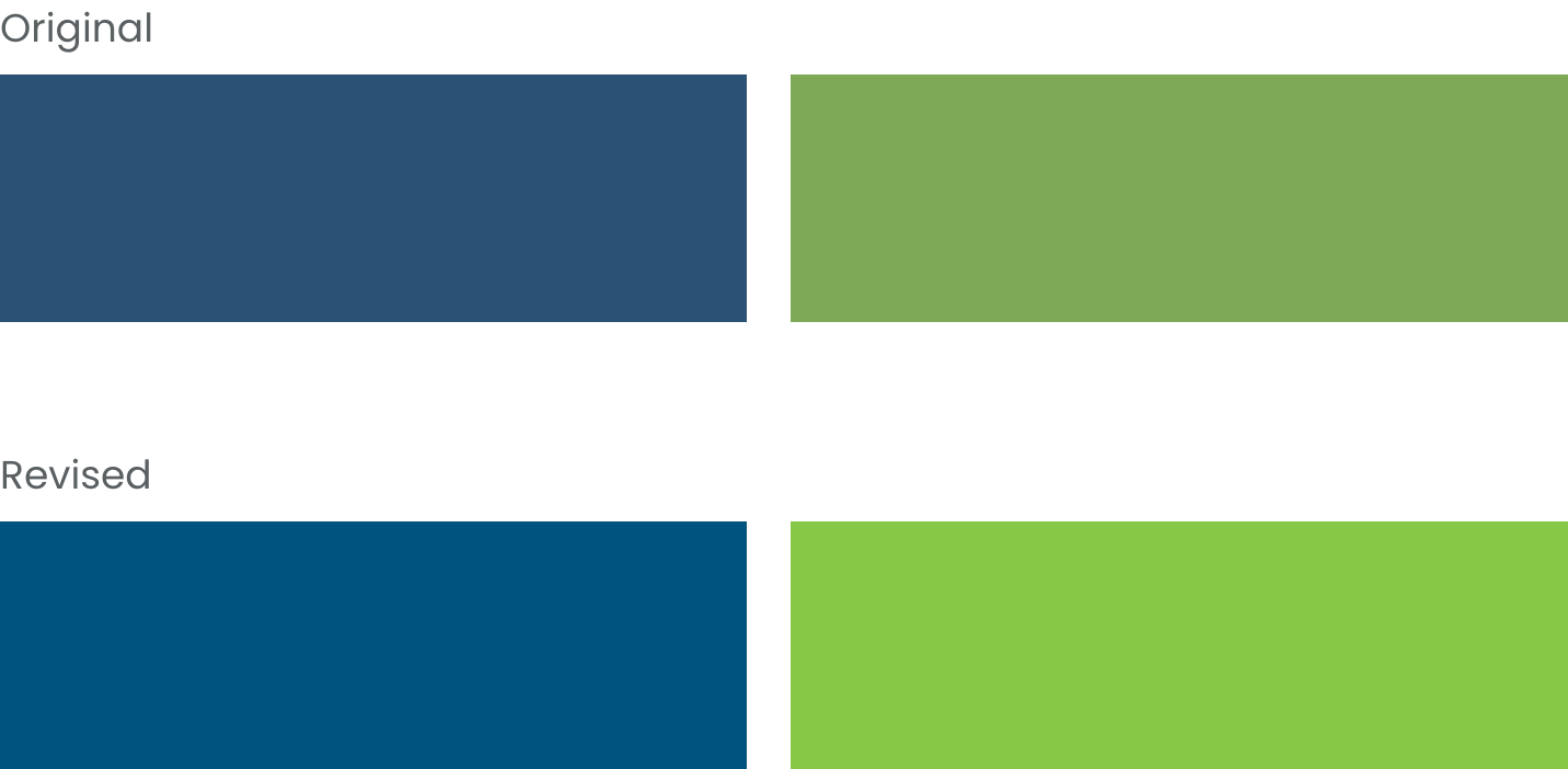
I discovered that some of the end-users were of an older demographic and preferred to have printed materials vs. digital counterparts. Unfortunately, the current palette didn’t print well; it looked muddy and cold. To counteract this, I brightened the colors to keep the brand vibrant and friendly.
Typography
The original headline font felt outdated and cold. To bring a human and approachable element to the type, I changed the head and subhead font to Raleway. It still has a professional feel, but the nice curves warm it up.

Crafting the design
Corporate Identity
“How”
“What”
Corporate Identity
The corporate identity is kept clean and professional. It incorporates the footer graphic developed earlier.

“How”
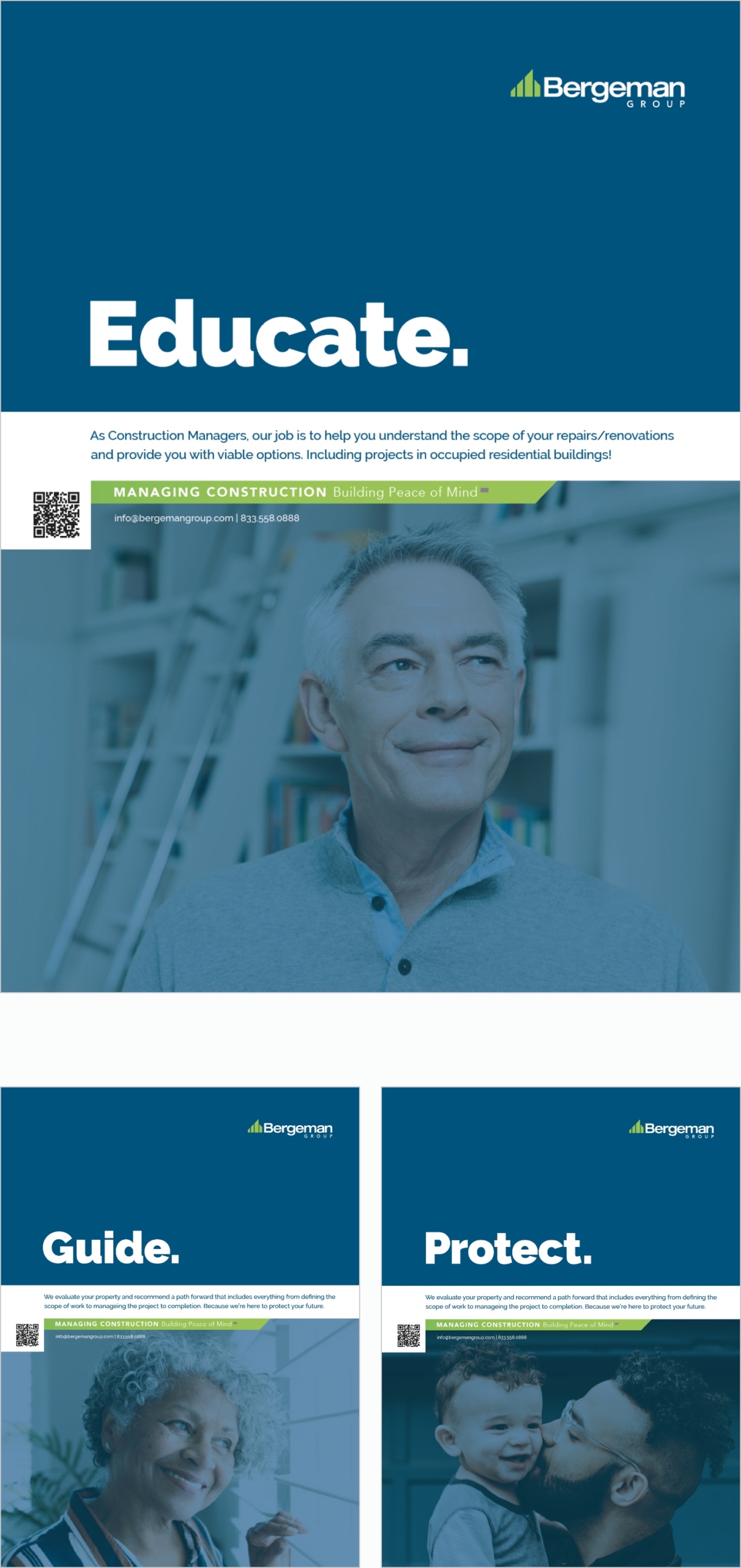
Since the “Why” was already defined in the tagline “Building Peace of Mind,” the ads focus on explaining “How” we build peace of mind. Through education, guidance, and protection.
“What”
The final component is “What” we do. These are the services the Bergeman Group provides.
Tradeshow Banners

Iconography
Website
Putting it all together
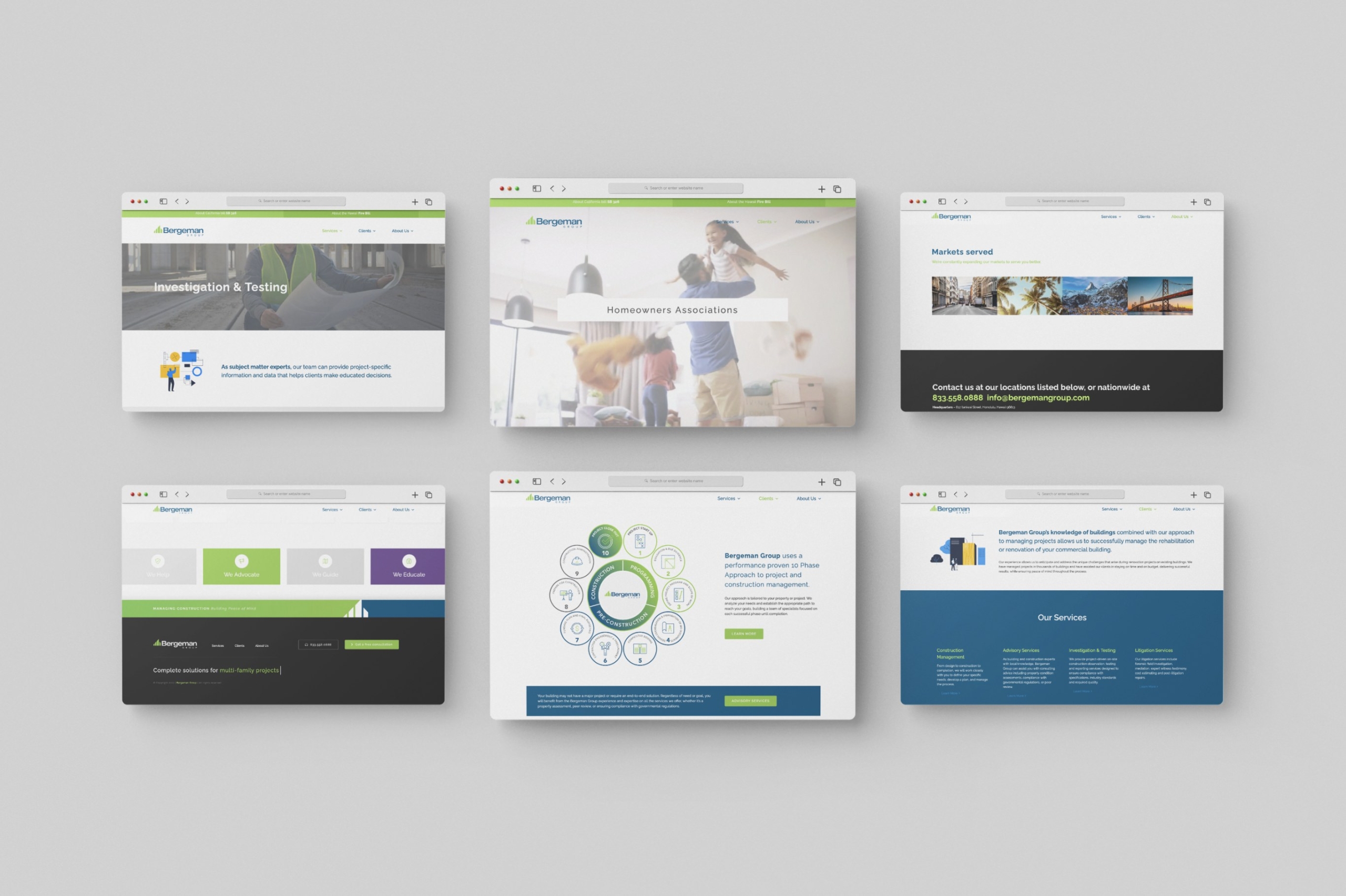
The “Why” and the “How” are how we build a lasting brand and a loyal following. I established the “Why”, the purpose of the Bergeman Group, with the tagline “Building Peace of Mind.” For the “How,” I showed they provide peace of mind through education, guidance, and protection.
The look and feel of the brand are clean and professional yet warm, caring, and approachable.
Takeaways
What I learned:
This project taught me how important it is to thoughtfully communicate branding concepts to the client and be a brand guardian. Without a watchful eye, the marketing often erodes back to “What” the client does instead of “Why” and “How.” My goal is to help the client consistently present themselves as a partner and advocate for its customers instead of a commodity to fill a role.
Thank you for your time reviewing my work!
If you’d like to get in touch, please reach out at: william@wmdesignworks.com
