VIGOR
Case study of the redesign of VIGOR.net
An overview of VIGOR
At it’s heart, VIGOR builds things and it repairs things. Big things. Marine, nuclear, aerospace, defense, infrastructure, energy.
This case study focuses on visual design of VIGOR’s website redesign.
VIGOR and me
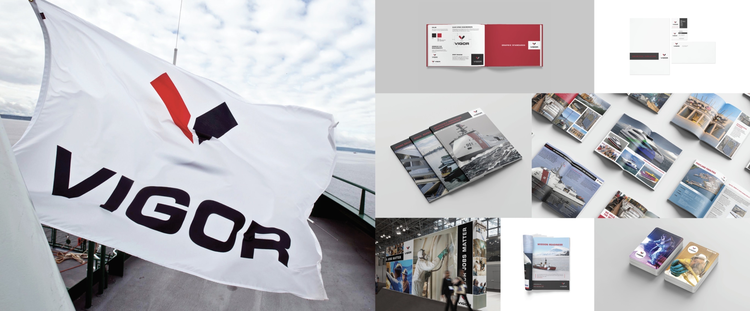
While working at the Maris Agency, a primary client was VIGOR. I crafted the visual direction of the branding, marketing, and communications in collaboration with the copywriter and creative director, Athena Maris.
During my tenure, VIGOR grew from a single struggling shipyard to a thriving diversified industrial business with six locations and 2,300 employees.
Website Project duration:
4 months.
Project overview
The challenge:
Vigor has many overlapping businesses. Users were having difficulty navigating the website to find specific projects, resulting in a high drop off rate.
The goal:
Create a web presence that allows visitors to quickly and efficiently find the information they are looking for in an exciting visual manner.
My role:
Visual Design / UI design
Responsibilities:
Visual Design, mock-ups, hi-fi prototyping, and iterations.
Approach:
Empathize, concept, mock-up, prototype, and test.
Results:
The finished product is an easy-to-navigate, visually engaging experience. The homepage has large images that entice users to click and explore the incredible projects VIGOR has delivered. The site is designed so the casual user, that only wants to see the bigger-than-life projects, can navigate through the imagery.
The main menu is now designed for users looking for specific information. The old site saw a high drop-off rate because finding the intended information was frustrating. The new site produces a higher conversion rate.
Job seekers found the career section easier to use, and surveys reveal that applicants have an improved understanding of the VIGOR culture and values.
See the live site at VIGOR.net


Understanding the user
Primary user group
Having worked on the Vigor account for several years, I was familiar with their business. What I didn’t understand was their website user.
A primary user group identified through research are journalists trying to research specific projects to create news content. We conducted interviews to find out the pain points the journalists were experiencing.
An insight from user interviews was this group already knew about the business of VIGOR. What they were coming to the site for was information about specific projects. They found the old site hard to navigate and resorted to calling VIGOR Public Relations to seek out information.
Result
We created a mega menu as a way for users looking for specific information to navigate. We chose this format after testing several options.


Second user group
A second user group identified were job seekers. These users wanted to get a sense of VIGOR and its culture before applying.
This group expressed frustration that the old site didn’t provide much insight into the culture, working conditions, or what it would be like to be a part of the VIGOR team. They didn’t feel any sense of excitement.
Result
We redesigned the career pages to feature information about the company culture and values. We also included videos of employees discussing what they love about working at VIGOR. Before potential employees see what positions are available, they already understand what life would be like at their new job.


The design process
Inspiration
Paper wireframes
Hi-fidelity prototype
Testing
Inspiration
Since I was the one who created the brand identity and marketing materials for VIGOR, I already had a sense of how the website should look and feel to stay on brand, including the image style, the typography, layout structure, and the color scheme.
Paper wireframes
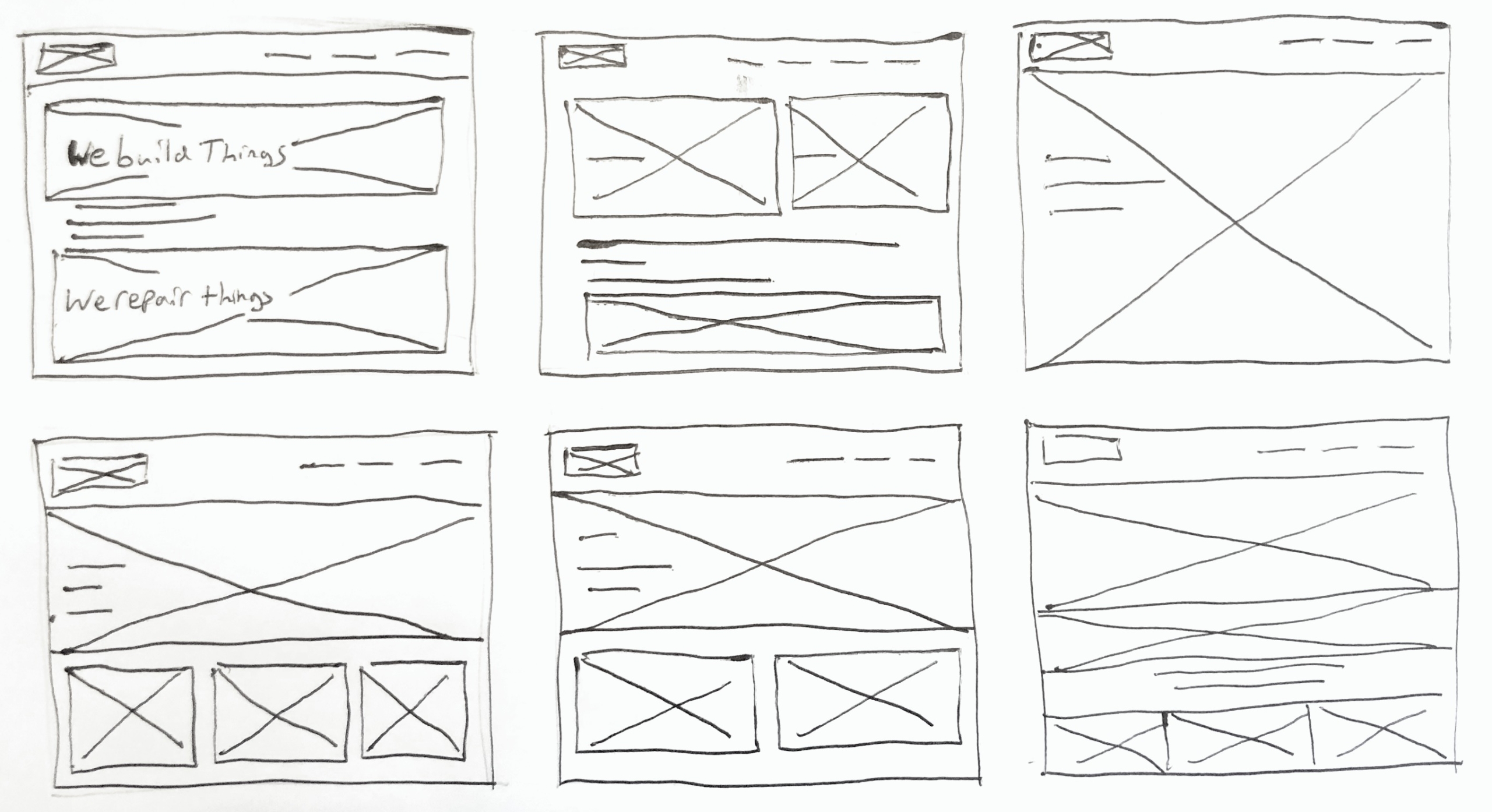
Sketching several iterations for the home page helped hone the most straightforward design solutions. I prioritized a visually striking design with two main clickable areas, one for We Build Things and one for We Repair Things.
Hi-fidelity prototype
Once I finalized the home page, I could quickly create mockups of the rest of the site based on my knowledge of the brand.
I then connected the mockups to create the hi-fidelity prototype to be tested and iterated upon the findings.

Handoff
After approval of the designs, I worked closely with the development team to ensure the final product came out as intended. I provided them with final assets, design specs, and responsive versions. We collaborated to trouble shoot issues and worked together to find compromises when appropriate.
Design decisions
Typography
The typeface Roboto was chosen for its ease of reading and stable feeling. Its simple forms contrast nicely with the colorful and bold imagery.
Color
I chose the color scheme to stay within brand standards and pass WCAG 2.0 AAA accessibility. The red gives a feeling of energy and passion, and the black provides a sense of power, authority, and elegance.
Imagery
The imagery showcases black and white portraits of the workers engaging with the camera. The photos are gritty and honest and do a fantastic job of showing the personality of the artisans. The product and location shots are colorful and expansive, bringing the projects to life.
Layout
I used white space generously to give the layout structure and hierarchy. This decision guides the eye across the layouts giving the user plenty to look at but in a digestible way.
Calls to Action
Buttons are large and create a focal point.
Navigation
We crafted the navigation to give the user choice in navigating the site. A search bar is prominent and excellent for users looking for specifics. The pages contain graphical navigation for those wanting to explore the site. The menu gives an excellent overview for those who know the general area they wish to explore but not the specific page or subject.
Final design
Visit
VIGOR.net

Accessibility considerations
Takeaways
What I learned
Takeaways
Impact:
Shortly after I finished this site, global investment firm The Carlyle Group acquired VIGOR.
What I learned:
Honestly, this was the first website I’ve worked on in years. I knew nothing of User Experience, or even there was such a thing. Overall I’m pretty proud of the site, but I can look back and see many minor problems that I wish I could change. For instance, the X to close the overlay on the search page is tiny. Some of the color combinations on the career page aren’t consistent. The navigation items don’t give the user any feedback on hover. Breadcrumbs would give the user better control of their navigation. These minor issues contribute to a less than ideal user experience.
Now that I’ve taken some UX design courses and learned more, I believe I could have fixed many issues with proper usability testing.
Thank you for your time reviewing my work!
If you’d like to get in touch, please reach out at: william@wmdesignworks.com
